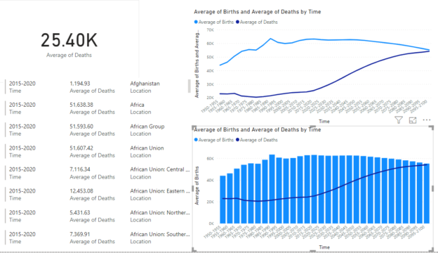
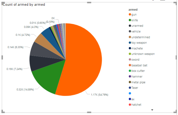
In this article, you will look at Power BI Waterfall charts and see how they can be used to plot distributions of numeric data against categorical data. You will also see how you can combine multiple charts in reports view to create Power BI combined visuals.
Read more »