Introduction
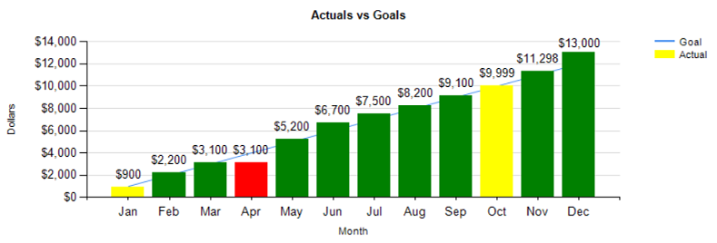
As we are nearing the end of the North American summer, I thought that we would take a lighter look at nifty ways of reporting information. In today’s “fireside chat” we have a look at a unique way of displaying our information using charts and line graphs all in one single chart (see below). We shall take things one step further and work with the color fill of the vertical bars to reflect the values that they represent.
Let us begin!
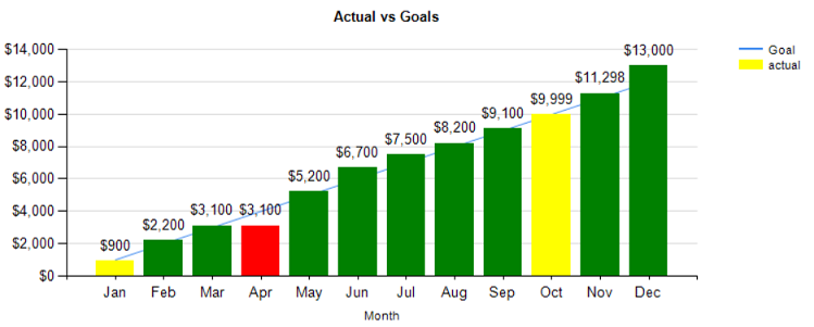
We are going to look at some sales data from one of my South African clients. Obviously, the numbers have been altered for confidentiality reasons. The client had requested a series of reports in bar chart format showing actual revenue while having the monthly goals display in line graph format. Moreover, the vertical bar color fill would reflect the ratio of the “actual” to the “goal”. Red being definitely under target, yellow as near target and green above target.
Our finished chart may be seen below:
Let’s see how we can produce this chart.
We begin by open “SQL Server Management Studio” and opening the SQLShack database (which we have worked with in past “get togethers”).
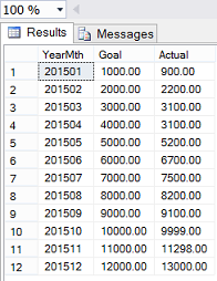
We look at the “MonthlyGoalvsActual” table which contains sales and goal data for the financial year 2015.
We note that there are three columns. The first, the year and month measured, the second being “monthly goals” and the third actual month’s sales.
In addition to these three fields, we also require the three character month name, which is obtained by through passing the year and month combination to a function (dbo.Monthee) which I created. Our code for this function may be found in Addenda 1.
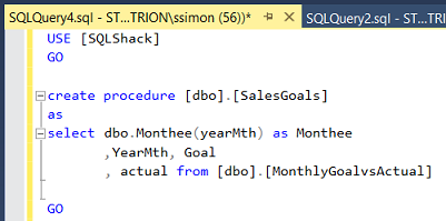
We begin by creating a stored procedure to pull this data (above).
Developing a report
Using SQL Server Data Tools 2010 or a higher version, we create a new “Reporting Services” project. Should you not feel at ease designing such a project, then do have a glance at my SQL Shack article entitled “Now you see it, now you don’t”, where I describe the process in great detail.
At this point, we shall assume that you feel comfortable working with a Reporting Services project.
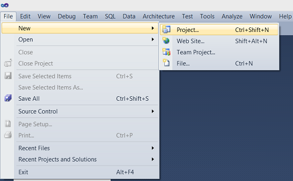
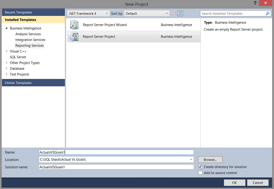
Opening SQL Server Data Tools, we create a new Reporting Services Project (above).
We give our project a name (above). We accept and return to the report design surface.
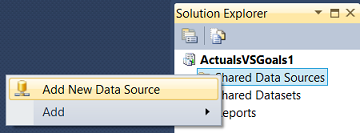
We must now add a new ‘Shared Data Source’(above). As I have mentioned many times before, a data source is similar to a garden hose. This garden hose connects to the tap on the house (the database) and the other end of the data source empties into a watering can (the dataset).
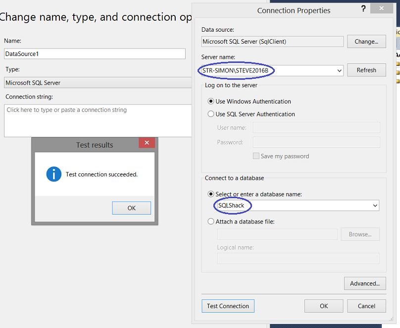
We enter the name of the server and connect our new ‘Shared Data Source’ to the “SQLShack” database (above). We click ‘OK’ and ‘OK’ again to leave the “Shared Data Sources” dialogue box and we are returned to our report.
Our next task is to develop a report.
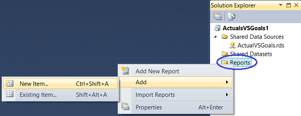
We now right click upon the “Reports” tab (above) and select ‘Add’ and then ‘New Item’ (as above).
We create a new report called “SalesVSGoals”. We accept and return to the report.
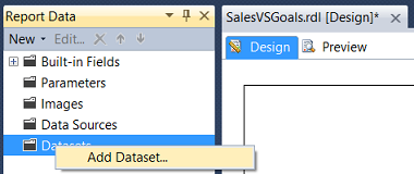
Our next task is to add a dataset. We right-click upon the ‘Datasets’ tab and select “Add Dataset” (above).
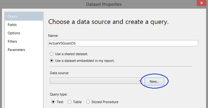
The ‘Dataset Properties” dialogue box opens. We give our dataset the name “ActualVSGoalsDS”. We now click the ’New” button to create a new local ‘Data source’ (above).
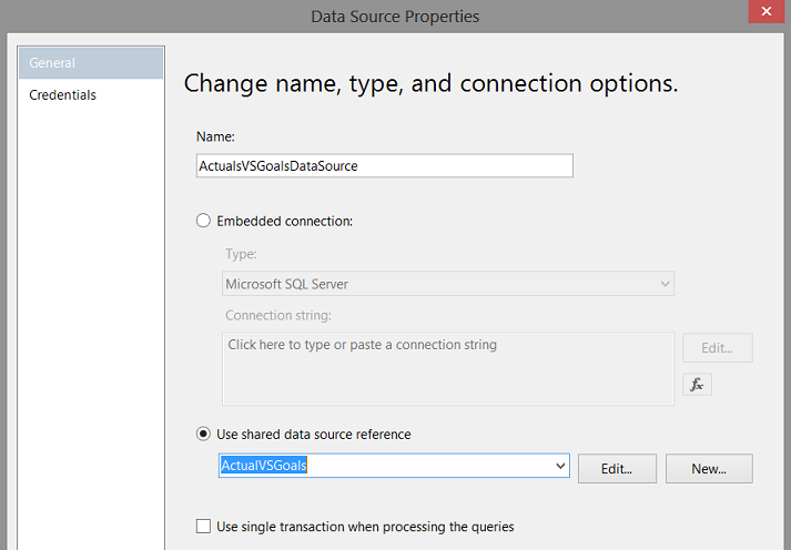
The local ‘Data Source Properties’ box appears. We give our local “Data Source” a name and point it to our ‘Shared Data Source’ that we created a few moments ago (above).
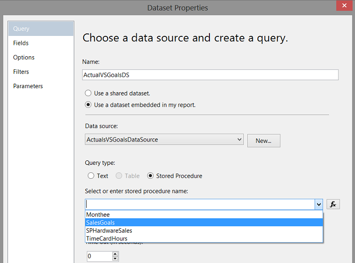
After having created our local “Data Source”, we find ourselves back on the “Dataset Properties” screen. We select “Stored Procedure” as the “Query type” and select the “SalesGoal” stored procedure that we just created above (screen above). We choose ’OK’ to leave the “Dataset Properties” dialog box.
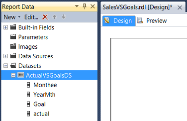
We return to our report and we also find that the system has created the dataset (screen above).
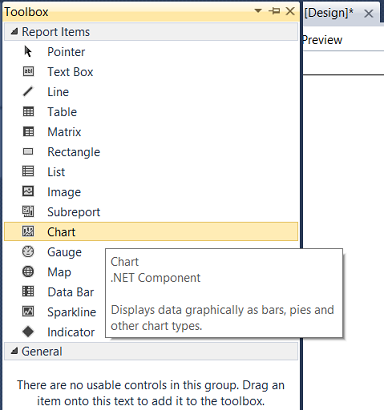
We drag a “Chart” from our “Toolbox” onto our report (above).
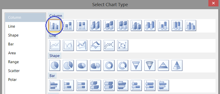
The “Select Chart Type” dialogue box opens. We select a “Column” chart (above).
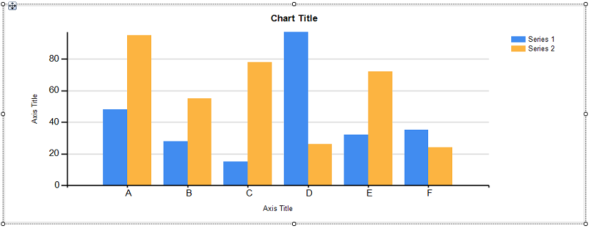
Our “Column” chart is placed upon our report surface (above).
Clicking on the chart and opening the “Properties Window”, we are able to link the dataset which we just created to the “DataSetName” property of the chart (see below).
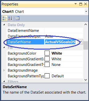
Having set the “DataSetName” (above), we click on the chart surface to bring up the “Chart Data” dialog box (see below).
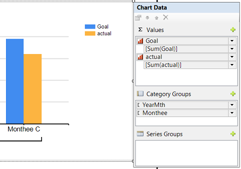
We select our “Goal” and “Actual” fields for the ∑ values (above) and set the “Category Groups” to “YearMth” and “Monthee”. Whilst we shall not be utilizing the “YearMth” combination per se, it will, however, be utilized to ensure that the months are correctly sorted according to chronology and not via the actual month name as alphabetical sorting would place the months in the wrong order (above).
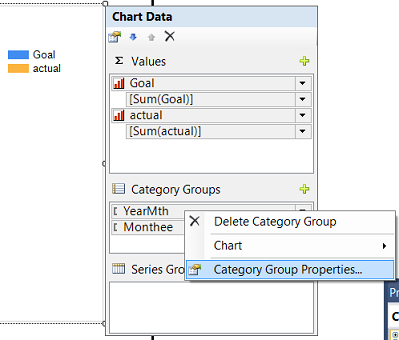
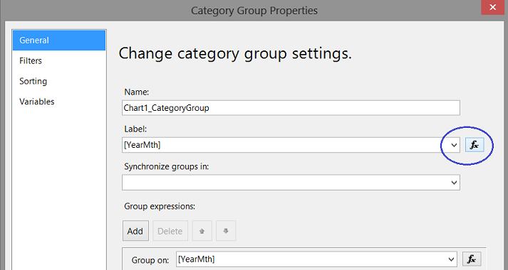
As “YearMth” is our primary sort field and as we do not want it to be visible on our final report, we right click upon “YearMth” and select the ‘Category Group Properties’ to open the “Category Group Properties” dialog box (see below).
We click on the button as may be seen above. The “Label” function dialog box opens (see below).

We alter the expression “=Fields!YearMth.Value” to

We accept and the dialogue box closes, returning us to our report.
We give our chart the title “Actual vs Goals” and set the name of the “X” axis to “Month” and the “Y” axis to “Dollars” (above).
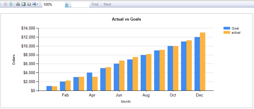
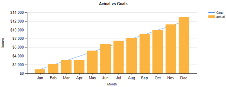
Running our report we find that our “Goals” and “Actuals” are shown. One issue is that only every second “Month” name is displayed. We wish to change this so that every month name appears on the “X” axis.
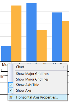
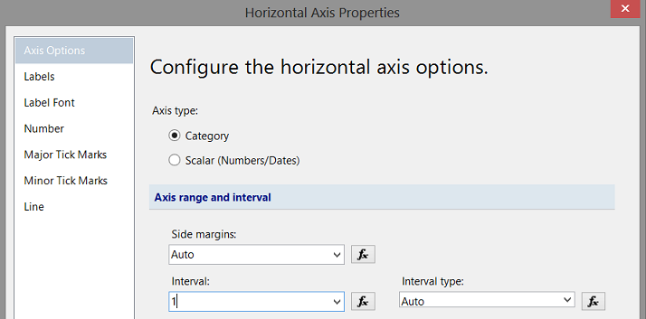
By right-clicking upon the “X” axis, we select the ‘Horizontal Axis Properties’ option. The ‘Horizontal Axis Properties’ dialog box opens.
We alter the “Interval” property from ’Auto” to 1 (above) and accept the change and leave the dialogue box.
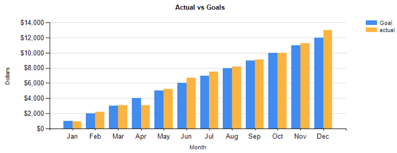
Having a look at our modified report, we see that every month is now displayed.
Altering the GOAL portion of the chart to be a line graph
As a part of the original specifications, the portrayal of monthly goals was to be a line chart. Now, most Excel folks would tell you that this is a “snap” to do! In Reporting Services creating the line graph (whilst simple) requires knowing where the change must be made.
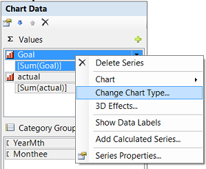
Within the “Chart Data” dialogue box, we right click upon the “Goal” field and select “Change Chart Type” (above).
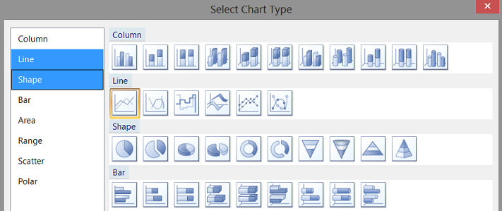
Once again the “Select Chart Type” dialog box opens. This time, however, we shall select “Line” (above). We accept the change.
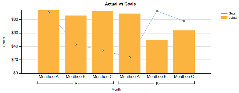
We are returned to our report surface. We note that the “Goal” vertical bars are no longer there but rather a line graph in its place (above).
Running our report, we note the following.
Let us now add the data values to the bar chart.
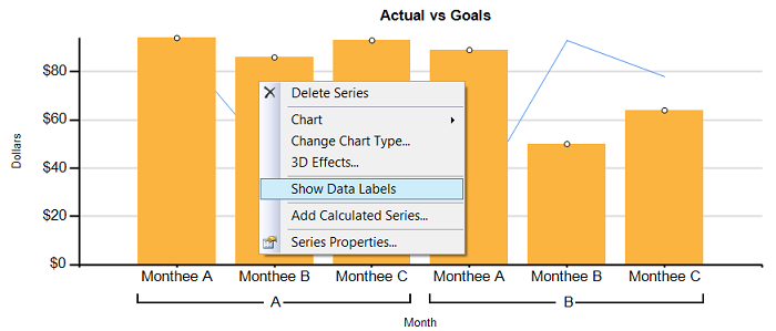
We right-click upon one of the “Orange” bars (above) and select “Show Data Labels”.
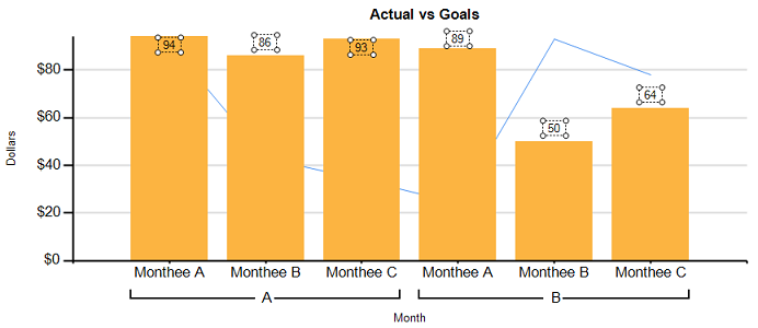
Sample label values appear in design view (above). These must be formatted to appear as Dollars.
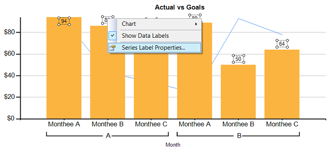
Right-clicking on one of the labels, we select “Series Label Properties” (above). The “Series Label Properties” dialogue box opens.
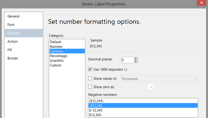
We configure the display to “Number”, “Currency” and set the “Decimal places” to 0. We also set the format for any “Negative numbers” (above). Our chart looks as follows in design view (see below).
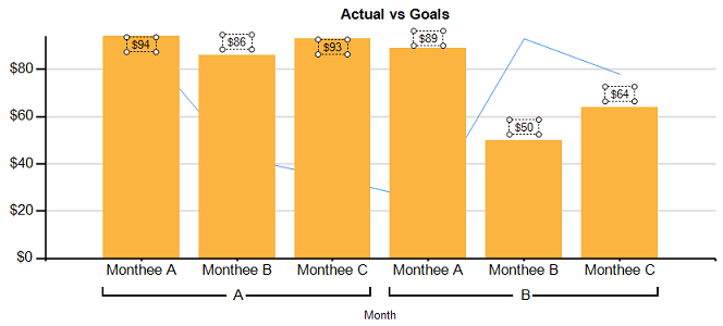
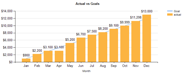
Running our report we note the following (see below)
Our last task is to compare the ratio of the “actuals” to the “goals”
The business rules are as follows.
- If Actual to Goal is less than .7999 make the fill of the vertical bar “Red”.
- If Actual to Goal is between .800 and .9999 then the fill is to be “Yellow”
- If Actual to Goal is greater than .9999 then the fill is “Green”
The code to achieve this is shown below:
|
1 2 3 4 5 6 |
=Switch (isnothing(Fields!actual.Value) , "LightGrey", Fields!actual.Value /Fields!Goal.Value <= .799, "Red" , Fields!actual.Value /Fields!Goal.Value >=.80 and Fields!Actual.Value /Fields!Goal.Value <=.999, "Yellow", Fields!Actual.value /Fields!Goal.value >=1, "Green") |
Changing the “Fill” colour of the “Bar chart”
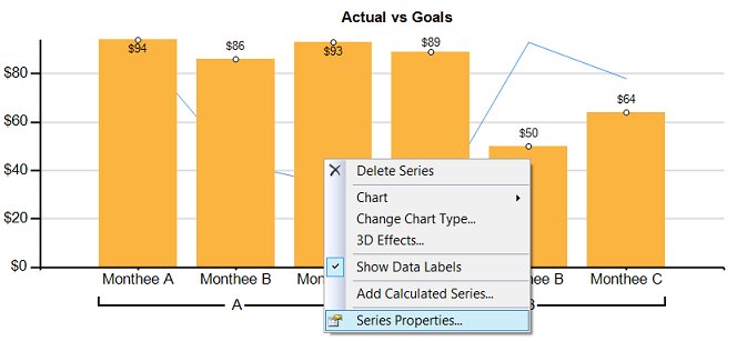
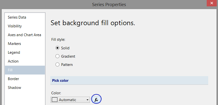
We right-click upon any one of the orange bars and select “Series Properties” (above). The “Series Properties” dialog box opens.
We select the “Fill” option and click the x button (above).

We place our “Colour Code” into the “expression box” and click “OK” and
“OK” to accept. We return to our report (see below).
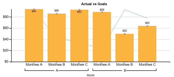
Clicking on the “Preview” tab, we find that color fill of our vertical bar “now represents the “actual to goal ratio” and that the line graph connecting the monthly goals is also present (above).
Thus our chart and report are now complete.
Conclusions
When it comes to “charting”, our first thoughts are to “throw” all the data into a spreadsheet and work with it from there. The issue becomes what to do when dealing with large amounts of data and complex joining of data sources. SQL Server Reporting Services provides virtually the same functionality as an Excel spreadsheet, however, it has the underlying power to process large amounts of data in an efficient and effective manner.
So we finish another “fireside chat”. I trust that I have left you with a few interesting ideas.
As in past, if you do have questions, please do feel free to contact me.
In the interim, happy programming!
Addenda 1
|
1 2 3 4 5 6 7 8 9 10 11 12 13 14 15 16 17 18 19 20 21 22 23 24 25 26 27 28 29 30 31 32 33 34 35 36 37 38 39 40 |
USE [SQLShack] GO /****** Object: UserDefinedFunction [dbo].[Monthee] Script Date: 8/15/2016 3:06:09 PM ******/ SET ANSI_NULLS ON GO SET QUOTED_IDENTIFIER ON GO create function [dbo].[Monthee] ( @YearMth as varchar(6) ) RETURNS Varchar(6) AS BEGIN declare @Return varchar(6) Begin Set @return = case when right(@YearMth,2) = '01' then 'Jan' when right(@YearMth,2) = '02' then 'Feb' when right(@YearMth,2) = '03' then 'Mar' when right(@YearMth,2) = '04' then 'Apr' when right(@YearMth,2) = '05' then 'May' when right(@YearMth,2) = '06' then 'Jun' when right(@YearMth,2) = '07' then 'Jul' when right(@YearMth,2) = '08' then 'Aug' when right(@YearMth,2) = '09' then 'Sep' when right(@YearMth,2) = '10' then 'Oct' when right(@YearMth,2) = '11' then 'Nov' when right(@YearMth,2) = '12' then 'Dec' else 'XXX' end end RETURN(@return) end GO |
References
- Expression Examples (Report Builder and SSRS)
- Background Color Formatting by expression in SSRS Report
- Charts (Report Builder and SSRS)
- Reporting in SQL Server – Using calculated Expressions within reports - December 19, 2016
- How to use Expressions within SQL Server Reporting Services to create efficient reports - December 9, 2016
- How to use SQL Server Data Quality Services to ensure the correct aggregation of data - November 9, 2016

